
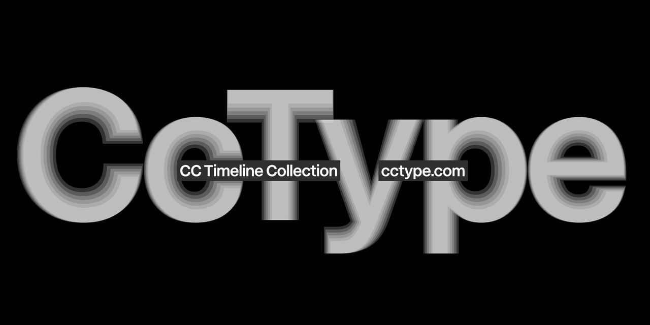
In a bold move that aims to revolutionize typography, Koto, a design agency based in London, has launched a new type foundry that is changing the way fonts are created, distributed, and utilized. This development not only redefines the aesthetics of digital text but also emphasizes functionality and accessibility in modern design.
What happened
Koto’s type foundry was established with a clear mission: to bridge the gap between traditional font design and contemporary needs. Unlike conventional type foundries that often focus solely on visual appeal, Koto places equal importance on the functional aspects of typography. Their approach integrates data-driven insights and user feedback into the design process, ensuring that each font is not only visually striking but also practically effective in various applications.
The first release from Koto’s foundry is a collection of versatile fonts specifically aimed at optimizing readability across different platforms—from websites to mobile applications. By collaborating with specialists in user experience and graphic design, Koto has created a methodology that sets a new benchmark in the design field. This includes adjustments to kerning, line height, and character width based on real-world usage data.
What it means for readers
This innovative approach to type design has significant implications for readers and users alike. The fonts created by Koto are tailored to be more legible, making them ideal for information-heavy environments such as blogs, eBooks, and instructional materials. Enhanced readability can lead to better comprehension and retention, which is invaluable in today’s content-driven world.
Additionally, the focus on accessibility means that Koto’s fonts are designed to cater to a diverse range of audiences, including those with visual impairments. This aligns with broader trends in design that prioritize inclusivity, ensuring that more users can engage with content without barriers.
For brands and businesses, the integration of these fonts can enhance their visual identity while improving the user experience. Companies that adopt Koto’s fonts may find they can communicate their messages more effectively, ultimately leading to higher engagement rates from their audience.
What happens now
Looking ahead, Koto’s type foundry is set to expand its collection, continually incorporating feedback from designers and users to create new font styles that address evolving needs. This iterative process suggests that the future of font design is not static but dynamic, with Koto at the forefront of this transformation.
Additionally, as fonts become more integral to brand identity and digital experiences, the design industry may see a ripple effect, prompting other foundries to adopt similar practices of user-informed design. It raises the question of how typography can continue to adapt in a world where digital communication is constantly evolving.
Ultimately, Koto’s innovative foundry signals a shift not just in font design but in how we perceive and engage with text. Readers and creators alike stand to benefit from more thoughtful, functional, and aesthetically pleasing typography that enhances the clarity and impact of written communication.
Original Source: https://www.creativebloq.com/design/fonts-typography/kotos-new-type-foundry-is-redefining-the-rules-of-font-design